A difficult question to answer would be “what’s your favourite font?”, and the reason is first that I love letters, so naturally, everything that has them included has a special place in my heart. Secondly, all the fonts have their beauty and can be used to make a great design, they just have to be used in the right way (even Comic Sans as we’ve learned in the first semester). And finally, if I have to choose one font as “the one” I would be leaving out several other great ones.
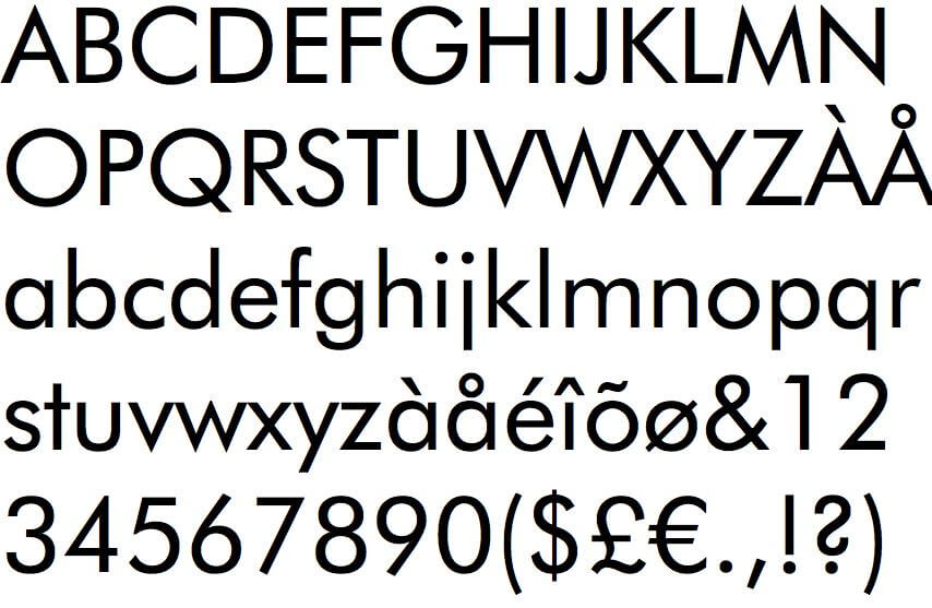
So, in this post, I decided to not talk about my favourite font, but one of my most used fonts, Futura. I think Futura is oddly satisfying to look at with that geometric, yet simple, clean and modern look. It is also a versatile typeface filled with elegance, which is great.
Futura is a geometric san-serifs typeface created by the German typographer, Paul Renner in 1927, based on visual elements of the Bauhaus design style and was designed as a contribution to the New Frankfurt project, an affordable housing project.
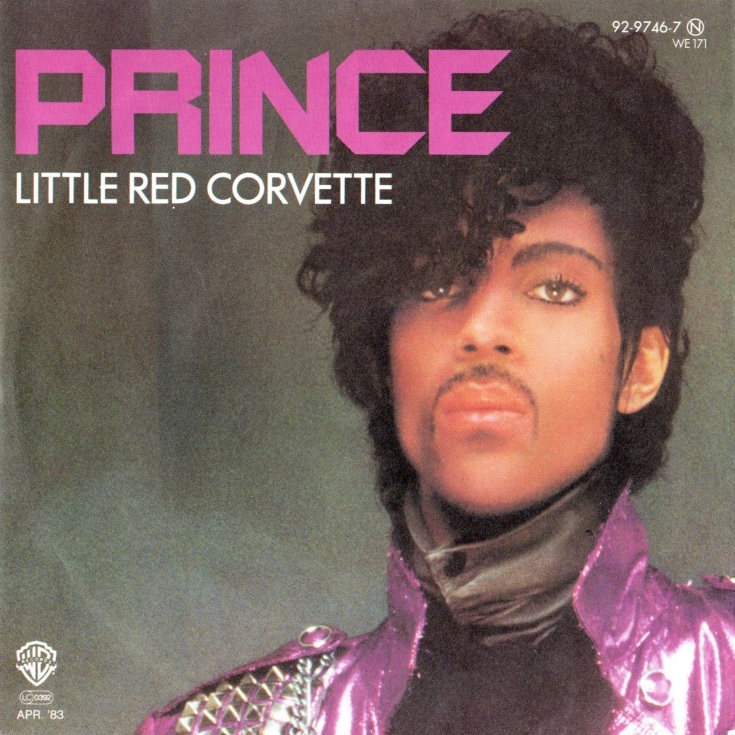
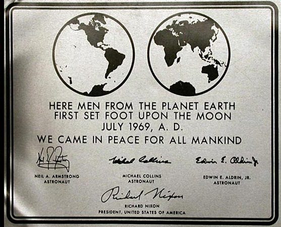
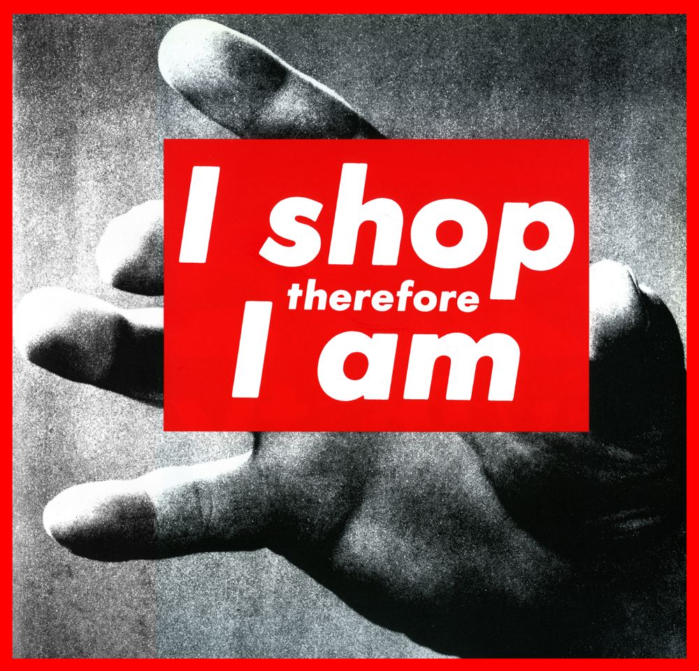
We see it frequently in ads, logos, artworks, titles, among others and some of it’s most notable usages were, for example, it appeared on the cover of Prince’s album “Little Red Corvette”, was used for “2001: A Space Odyssey”, was also used on the first commemorative plaque left on the Moon and Barbara Kruger also uses it in her artworks.
Here are some pictures of the examples:
See you soon!


0 Comments